Case Study
Recovery Unlimited’s Brand Identity
I was contacted by the client to overhaul the existing out-dated face and design of the alcohol and substance-abuse counseling center, Recovery Unlimited.
I was in charge of research, ideation, and design.
01.
Research & Sketch
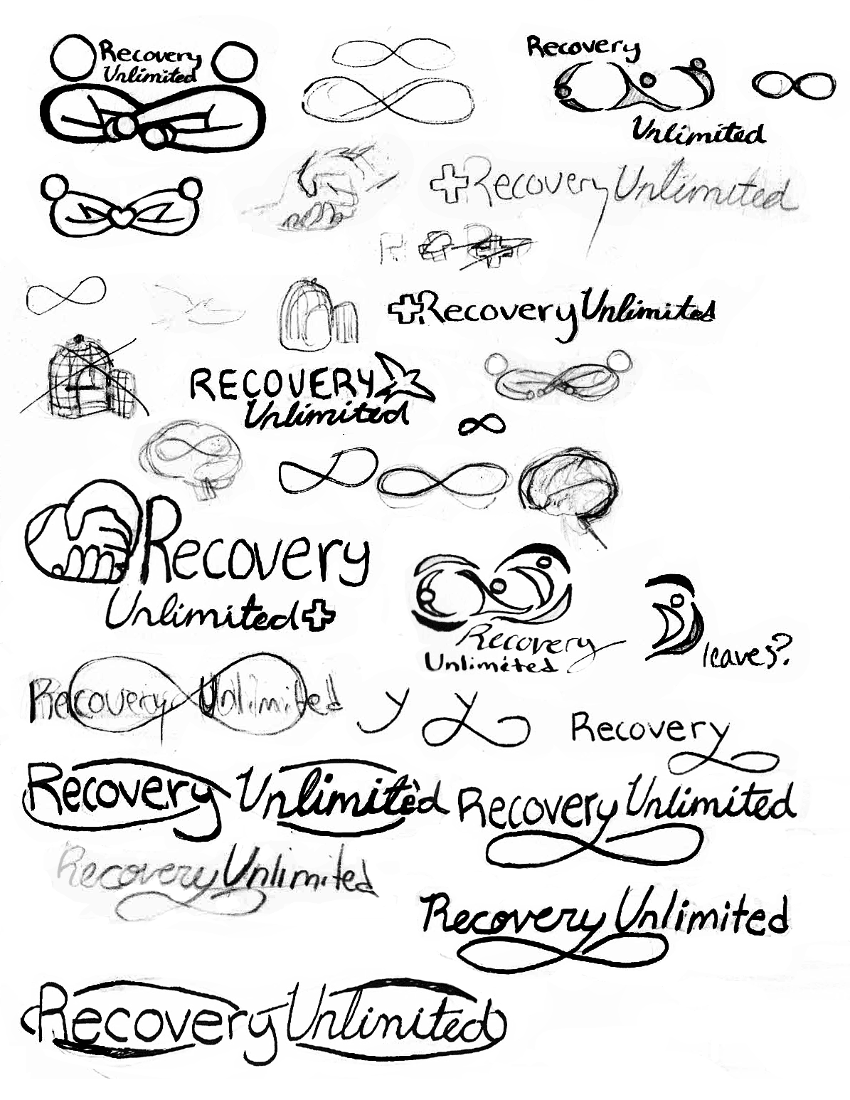
I started by researching similar counseling centers and facilities and noting how they displayed themselves—the tone and character expressed in the colors, logo, and overall design. I then sketched out various logo concepts, experimenting with different styles.
The client wanted to push the ‘Unlimited’ aspect of things, and I presented different forms this could take in the prospective logo; namely, the inifinity symbol.
02.
Prototyping & Monochrome Logo
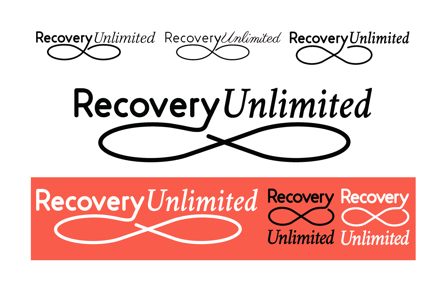
The client having selected the sketch to move forward with, I used Illustrator to design the protoype. I tested several different versions and fonts and presented them all to the client.
The italic serif was chosen for its elegance, trust, and more handwriten feel for a logo that conveyed the personal and safe environment of the counseling center. I refined and finished the chosen protoype, creating the monochrome version of the final logo.
The client also requested a logo with square proportions to be used as a website thumbnail.
03.
Developing Color Palette & Final Logo
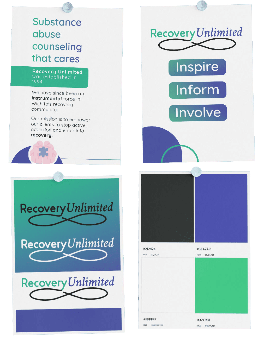
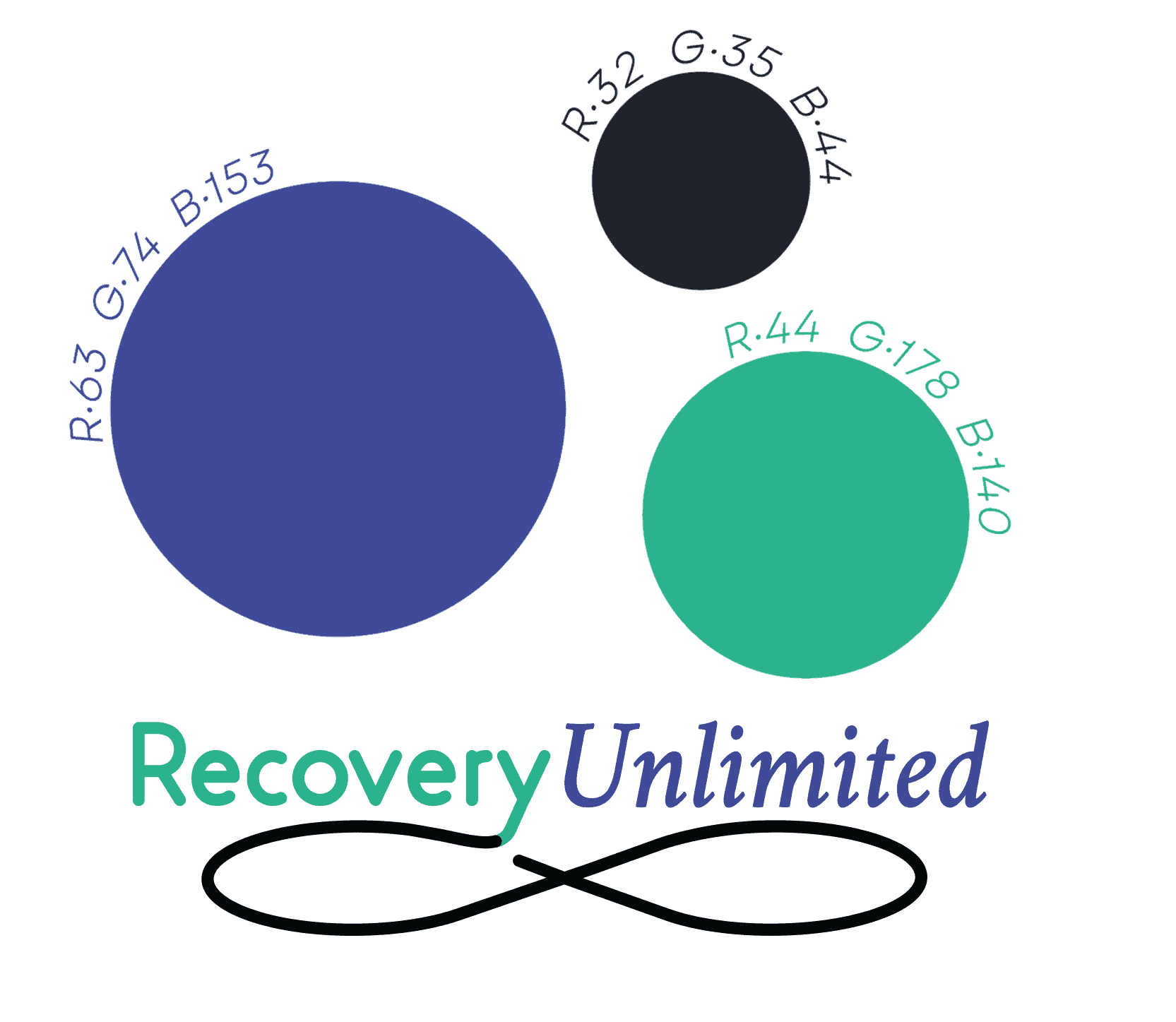
Following my brand research at the beginning, as well as interviewing the client on the vison for Recovery Unlimited and investigating colors that matched, I designed the palette: a dark, (slate) two midtones, (periwinkle and mint) as well as the light (white, as desired by the client).
To conclude the logo, I fitted the palette to the typography.
02.
Brand Graphics
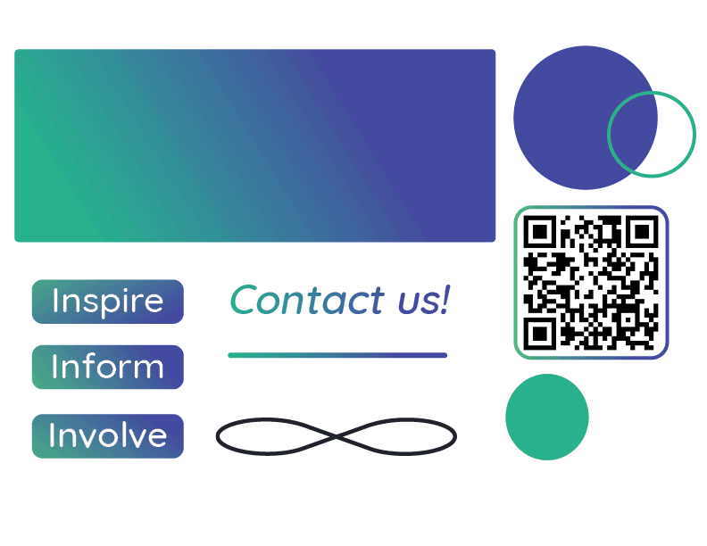
With the palette in hand, I moved forward to creating featured key graphics that would be integrated in Recovery Unlimited’s identity.
I was given the words ‘Inspire’, ‘Inform’, and ‘Involve’ as tagline pieces and created graphic elements accordingly. Additionally, circle frames and elements, a QR code frame, a gradient background, a leading line, and specific healine gradient and font rules were created to unify the brand no matter the application.
Results
Comprehensive & Unified Branding
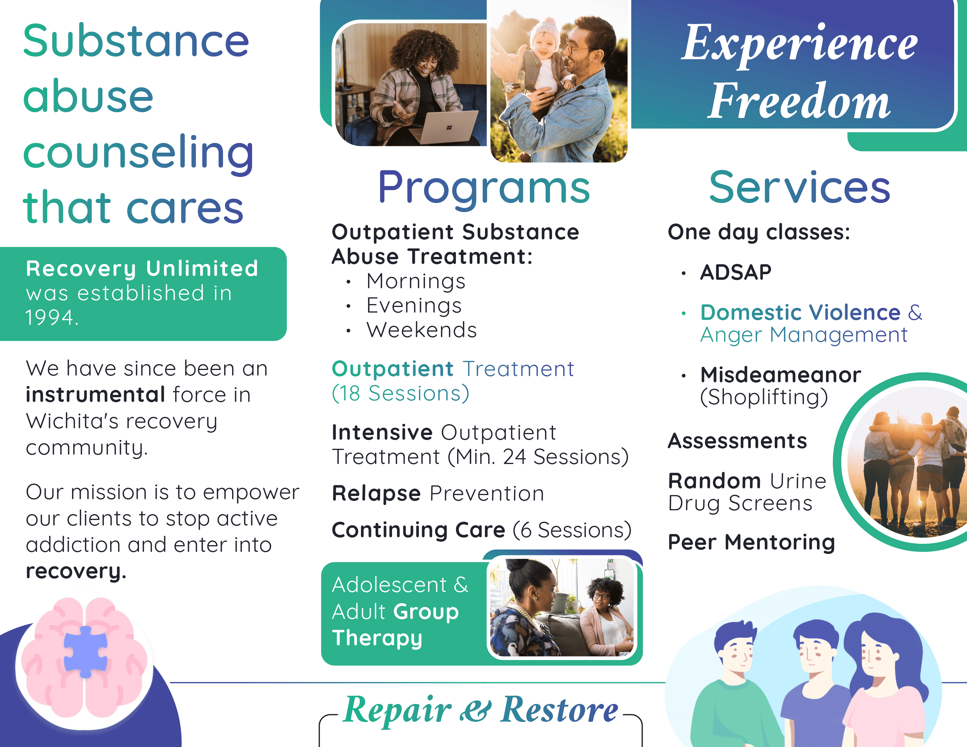
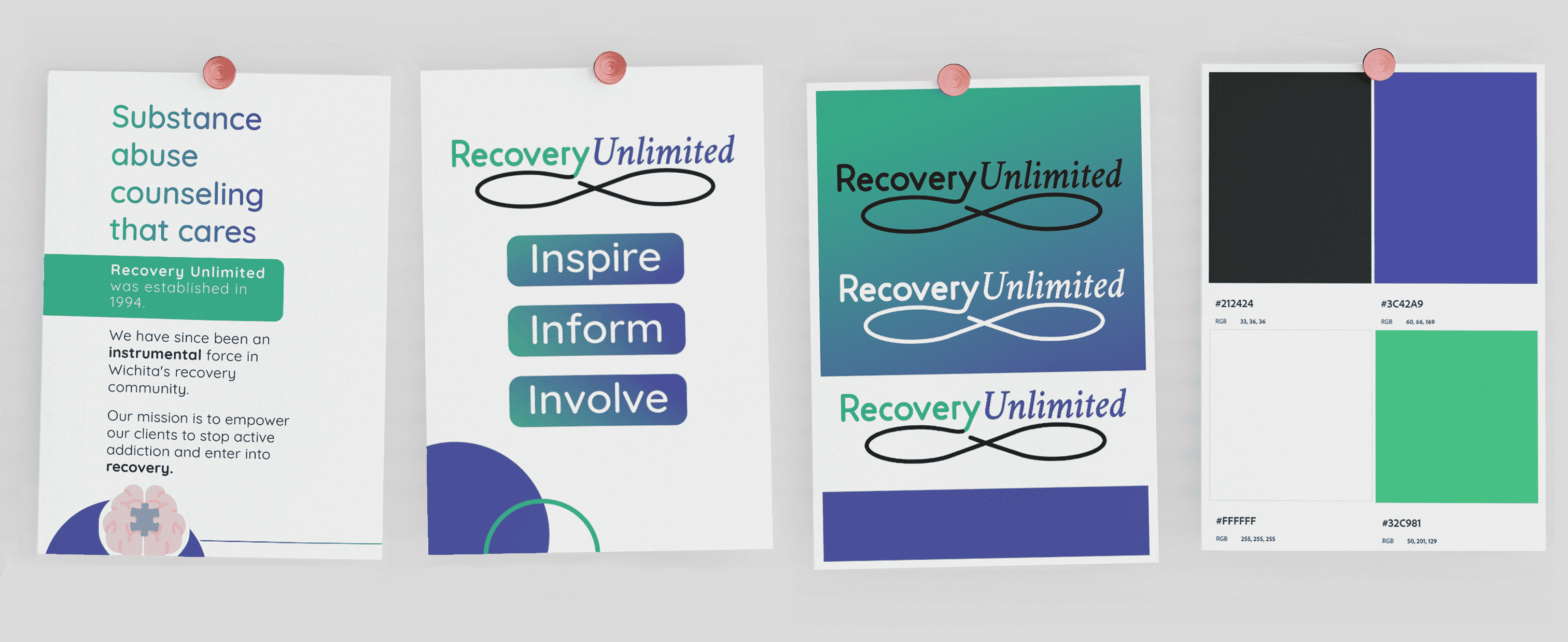
Armed with a completely redesigned identity, not only was a brochure displaying the new face of Recovery Unlimited made, but also the client was able to boldy showcase the new brand at a job fair—where much interest was shown towards the redesign.
Testmonial
“We are extremely impressed with the professionalism and quality of work Genesis has produced. She is now our go-to graphics designer. We love working with her and greatly appreciate her creativity.”
